Discover how visualizing data transforms complex ideas into clarity. Explore examples, insights, and creative ways to enhance communication.
Hey Friends! Winter’s settling in here in Chicagoland, but I’ve got some ideas to keep things warm and lively. Freshen your cup of coffee, and let’s dive in!
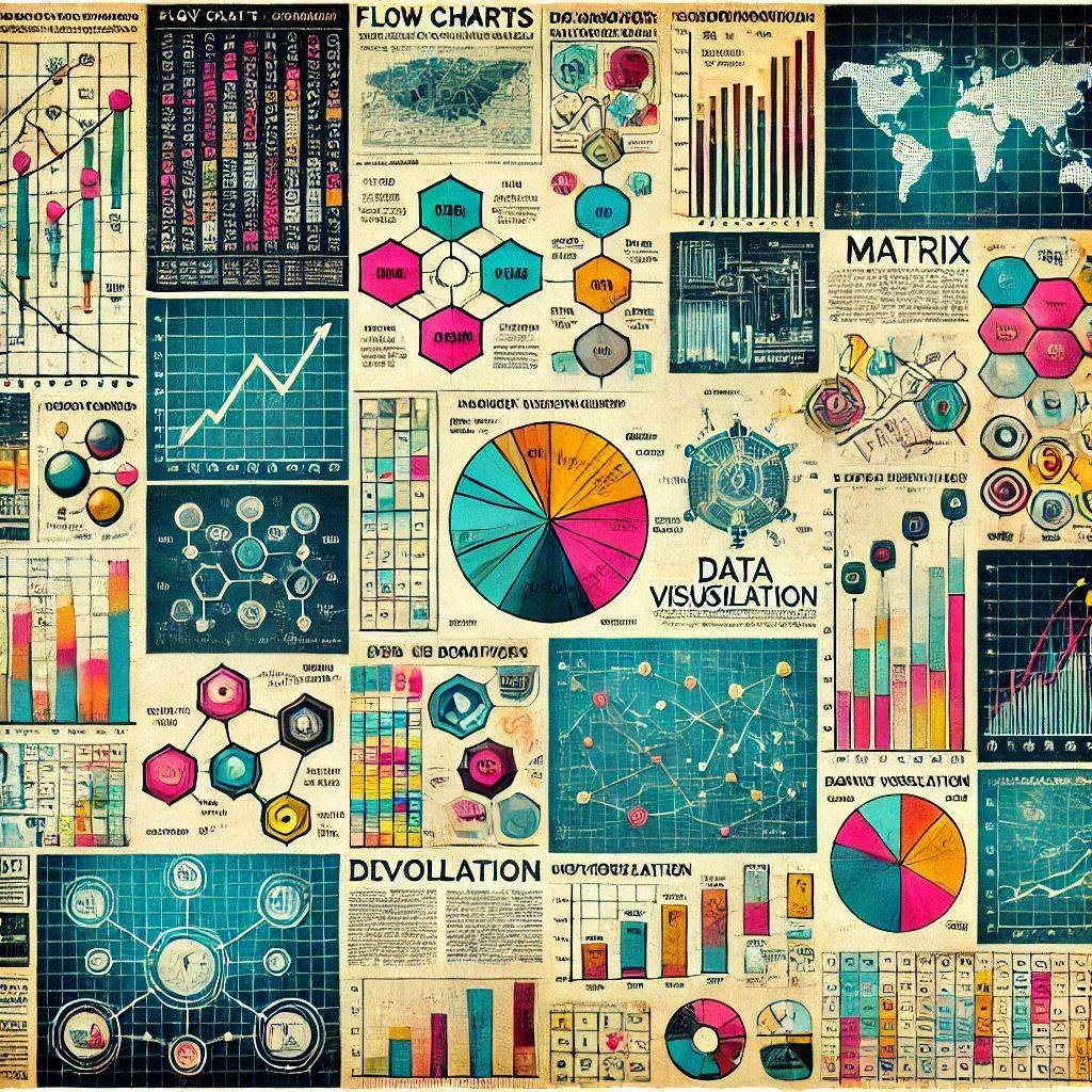
A Picture Is Worth 1,000 Words
It turns out the adage, “A picture is worth a thousand words,” actually has some scientific merit behind it (though the actual number may vary). According to my perplexity query, words take longer to process for three reasons:
Recognizing letters and words visually
Decoding symbols into language
Comprehending meaning
It takes hundreds of milliseconds to process text, whereas images can be processed in as little as 13 milliseconds. As a point of reference, it takes 300-400 milliseconds (approximately one third of a second) just to blink. Factors like complexity of word and sentence structure impact processing time as well.
So what?
With large language models (and high school teachers with newsletters) churning out more text than ever before, it got me thinking: might there be a better way to communicate a message? That’s when I remembered a Ted Talk I saw a few years back on the topic of data visualization. Around the same time, I noticed artists on social media visualizing complex concepts with remarkable clarity.
So that’s the topic for today’s newsletter: quantitative and qualitative data visualization.
Takeaway: It sometimes takes years to connect the dots. If you ever find yourself wondering what you’re doing falling down a strange rabbit hole, keep going. You may just need to fall a little deeper to find what you’re looking for.
David McCandless
The aforementioned Ted Talk featured David McCandless, a former journalist who wrote for The Guardian and Wired among other publications. His background in journalism inspired his interest in presenting complex information in a way that is engaging, clear, and easy to understand.
In his Ted Talk, McCandless highlights the overwhelming amount of data that we encounter (and create) on a daily basis and how it can be difficult to make meaning out of it. When those data are transformed visually, with design and aesthetic considerations in mind, that information becomes understandable and engaging. He argues that beautiful visuals can make complex ideas more accessible, intuitive, and even inspiring.
My favorite visuals from the talk include the Snake Oil Supplements bubble chart which evaluates the effectiveness of dietary supplements based on scientific evidence. Larger and higher-positioned bubbles represent supplements with more robust support for their claimed benefits, while smaller and lower-positioned bubbles indicate less evidence or efficacy.
I also like the Billion Dollar O Gram, a grid of colorful rectangles that compares billion-dollar figures across categories like government spending, corporate profits, and global issues. It offers a striking perspective on how massive sums of money are distributed and prioritized.
I love the clarity that these visualizations bring to incredibly complex matters.
Takeaway: Sometimes the story in your head makes perfect sense to you, but you’ve spent untold hours thinking about it from every angle imaginable. Others haven’t. Visualization can bridge that gap, transforming complexity into clarity and ensuring your message resonates with your audience.
Janis Ozolins
I came across a really talented creative named who specializes in a unique form of data visualization.
He takes interesting, and sometimes complex, concepts and boils them down to their most salient essence using simple graphics as in the example below:
As a high school teacher, who’s in the business of peddling concepts saliently, it got me thinking about how I might distill my instructional material similarly. I haven’t quite figured out where to start with this yet, but thinking about how I may is one of the things that keeps teaching interesting to me.
Takeaway: Not every creative idea needs an immediate purpose. It’s okay to collect ideas, trusting they may connect meaningfully in the future.
World Sketchnote Day
January 11th was “World Sketchnote Day.” If you missed it, or are new to sketchnotes, sketchnoting is a visual form of note taking that combines hand drawn figures, symbols, and icons with clever layouts and keywords that create engaging, structured representations of information.
They’re commonly used during lectures and presentations.
I stumbled upon sketchnotes a few years back on teacher Twitter (back when that was thing). I only recently discovered that sketchnoting originated with one specific individual—. He popularized the concept in the early 2000s and literally published the book on it in 2012.
Take a look at his work below, and consider subscribing to him on Substack.
It’s inspiring to me when creative people reimagine age old practices in new ways. Who would have guessed there was still room to evolve in the analog note taking space?
Takeaway: What practices do you take for granted that could be reimagined in a new and creative way?”
The Knowledge Graph
I previously put together a chart that explored talent vs. skill over time. In the spirit of data visualization, I want to share a new chart inspired by a concept my dad introduced me to during a long road trip when I was a teen.
I’m paraphrasing, but he said something to the effect of:
Knowledge can be lumped into one of three buckets: What you know, what you know you don’t know, and what you don’t know you don’t know.
For the life of me, I can’t remember how we got on this topic, but that’s the beauty of long car rides: talks get weird. Here’s what I think this concept looks like:
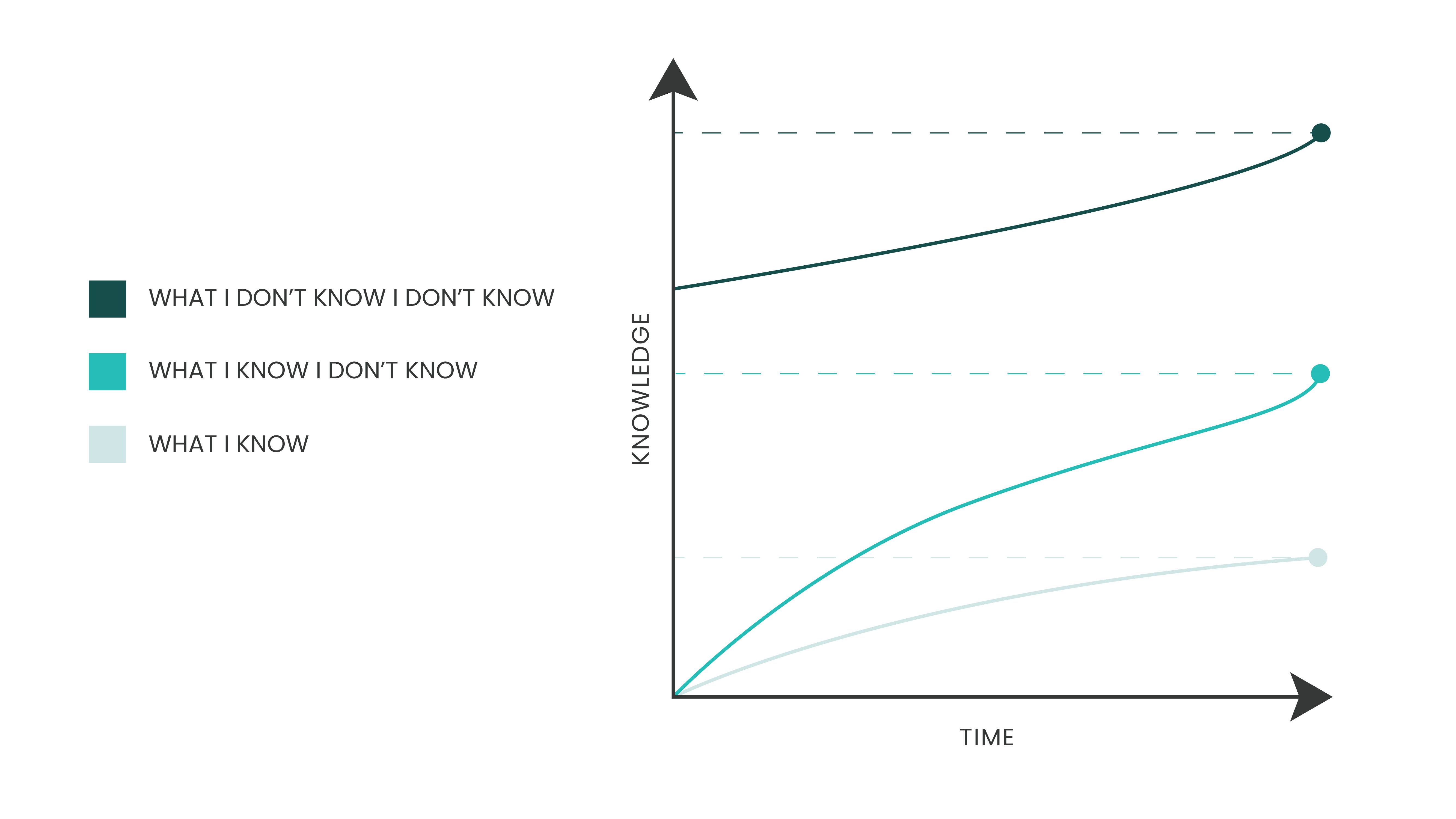
The graph shows that while your knowledge grows over time, so does your awareness of what you don’t know, leaving the vast unknown always expanding.
I enjoy sharing the three buckets of knowledge theory with my students. We spend most of our time learning. We only sometimes get to talk about learning. By compressing this concept into a graphic, it forced me to think about it more deeply. Here’s what I came up with:
When you’re young, you experience a burst of learning, but it’s hard to grasp how much you don’t yet know.
Over time, your rate of learning slows (though hopefully never stops), though as you learn more, you realize how much more you have yet to learn.
The sum total of the world’s knowledge continues to grow, seemingly at an accelerating rate.
Takeaway: What concept do you hold to be true? How can you express it visually to deepen your understanding?
One More Thing
Good things are better when shared. If you liked this, it would mean the world to me if you sent it to someone who might like it too.
Thanks for reading, and see you next week.
Until then,
-Mike