Dive into typography: Helvetica’s impact, Arial vs. Helvetica, Papyrus humor, ink-saving fonts, and creating your own font.
Hey Friends! It’s officially December. Mariah Carey has thawed out, and “All I Want For Christmas” is playing on the radio. My early gift to you is a roundup that’s all about typography. Go ahead and take that off your Christmas list. Let’s get into it.
Font of the Week
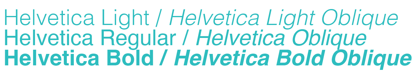
We’re going to start things off today with the font of the week which happens to be one of the most influential typefaces in history: Helvetica. Behold it in all its glory:
Helvetica is such a popular typeface that a group of filmmakers decided to make an entire feature length documentary about it, and believe it or not, it’s actually really good!
The aptly named film Helvetica, explores the history of the typeface from its Swiss origins to its near ubiquitous use today. It also explores the way design shapes our perception of brands, culture, information, and public spaces.
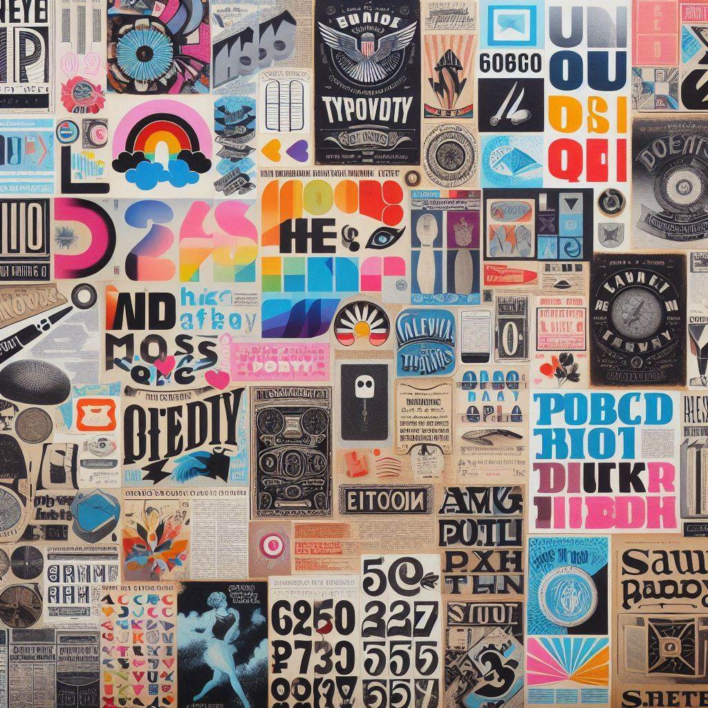
Now that you know it, you’ll see it everywhere. Here are just a few examples:
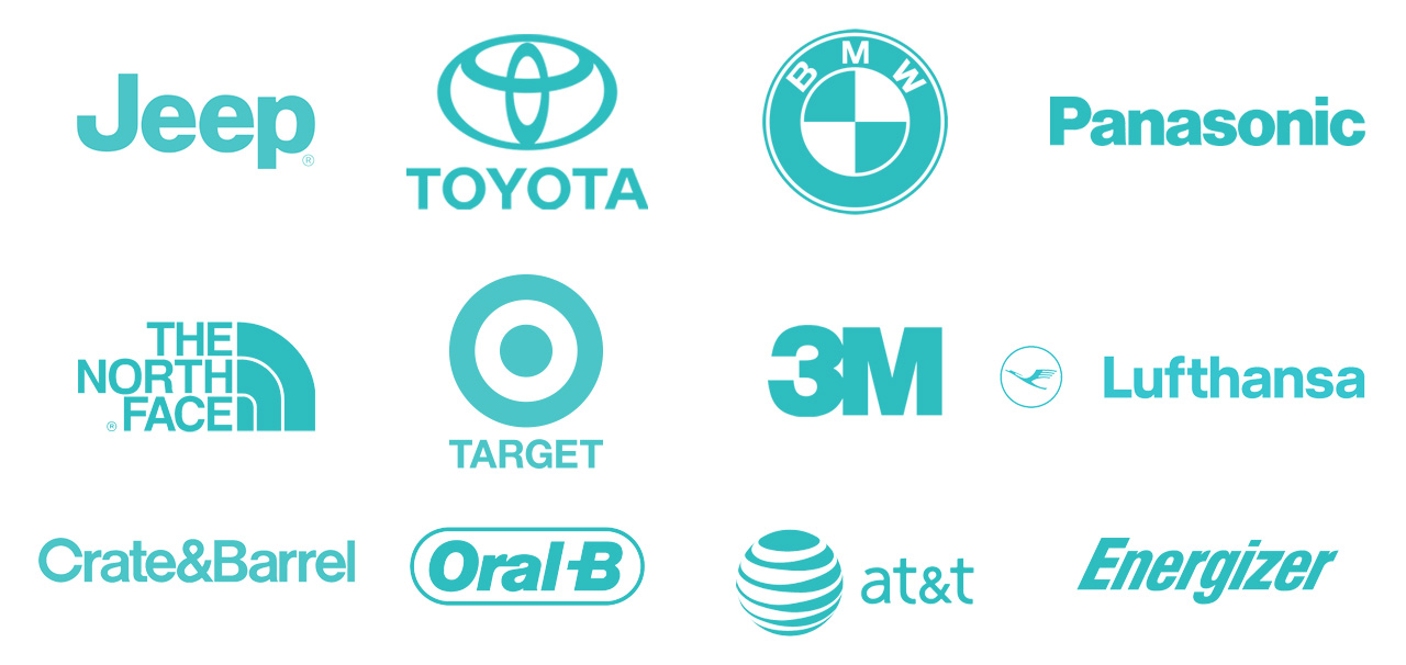
While some criticize its lack of personality and overall blandness, others praise it for its versatility and neutrality. Either way, it’s impossible to deny the impact that it has had on culture and society.
Takeaway: Despite it being one of the most important typefaces ever, it still has its haters. Your creative efforts will never please everyone, so be cautious about seeking validation in others’ opinions.
Arial vs. Helvetica
Arial is essentially store brand Coke. In 1989 Microsoft opted to NOT include Helvetica in its Windows 3.0 operating system. Despite its widespread adoption, its popularity meant the licensing fee was prohibitively expensive for Microsoft to include in its software by default.
Arial, created by Robin Nicholas and Patricia Saunders, at Monotype in 1982 was a digital first typeface intended to be a cheaper, more accessible alternative to Helvetica.
To the undiscerning eye, they look the same. Each individual letter is identical in width and height. They are similarly weighted, though not exactly so, and the kerning (the space between the letters) matches. From a design perspective they are geometrically similar enough that one is a reasonable substitute for the other.
Takeaway: while Arial is a perfectly functional substitute for Helvetica, it’s Helvetica’s enduring legacy, not Arial’s functional cost-saving, that gets the documentary treatment. In the world of design, and beyond, originality carries value.
Papyrus
Julio Torres wrote one of my favorite Saturday Night Live sketches of all time.
What started as a throwaway line in his standup routine, became a full-fledged cinematic short at the urging of guest host Ryan Gosling. The sketch centers around a man driven insane by the fact that Avatar, the biggest blockbuster of all-time, used the default font Papyrus for its logo.
If you haven’t seen it. Watch it below, and then check out the sequel.
I love this sketch, because I feel like it was produced just for me. The non-designers in my life mostly do NOT feel similarly, but I think that makes it even better. Those who go weak in the knees at the site an ascender, terminal end, or chiseled slab serif get it though, which offers an important lesson for all creatives: Aiming your efforts at everyone often means hitting no one.
Takeaway: When you target a specific audience, especially a niche one, your work will resonate in a much more meaningful way.
Not financial advice
In 2010, the University of Wisconsin Green Bay conducted a study that concluded serifed fonts used significantly more ink than sans-serif fonts. As such, they strongly discouraged the use of letterforms with squiggly ornamentation in printed documents and switched their default font to Century Gothic, from Arial (which isn’t even a serifed font, but is considerably “heavier” than Century Gothic) to reduce their ink costs.
This is a thing that actually happened. NPR produced a full segment on it that you can listen to here.
Then again in 2014, a 14 year-old named Suvir Mirchandani completed a science fair project that estimated by switching to Garamond, the government could likely save “about $234 million with worst-case savings of $62 million and best-case savings of $394 million” annually. The project was eventually accepted into publication in the peer reviewed Journal of Emerging Investigators.
Takeaway: want to retire early? Switch to Century Gothic.
Make your own font
The website caligraphr.com is a really cool website that turns your handwriting into a font. Here’s how it works:
Download and print a paper template
Write each letter of the alphabet in a corresponding box
Upload the file back to the website
The website will turn your handwritten letter forms into a custom font file.
In my web design and development course, I give my students 20 minutes each week to research a topic of their interest. As a capstone project, students build a website from scratch writing HTML and CSS. I’ve found the project resonates much better when the topic of each website is something that the students actually care about.
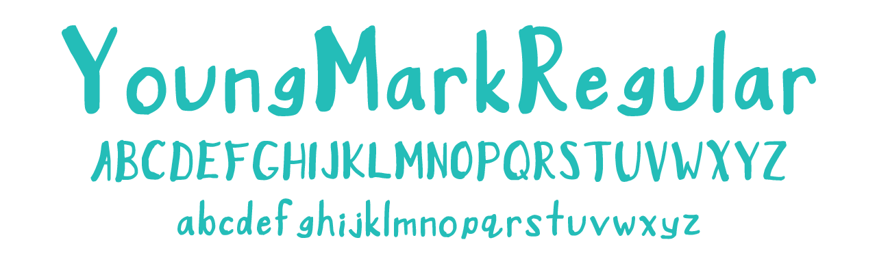
One year, one of my students decided to make her research topic typography (a student after my own heart). As part of her research she discovered this website and created the font you see below, which is also available for download here: YoungMarkRegular.ttf
Takeaway: When students are empowered to explore their curiosities and given authentic opportunities to showcase their findings, the caliber of their work often rises above the expectations on the rubric.
One more thing
If you’re reading this online, it would mean the world to me if you subscribed to my newsletter. It’s free, and always about creativity and innovation. If you’re already subscribed, please share this with a friend.
See you next week.
-Mike